
What is it?
Conexão Financeira is a portal for financial products and services for companies.
Challenge
To launch this project, the company asked us to first create its logo and visual identity. We then developed the website and style guide, ensuring communication was presented in a standardized and organized manner, regardless of the target audience’s channel of access.
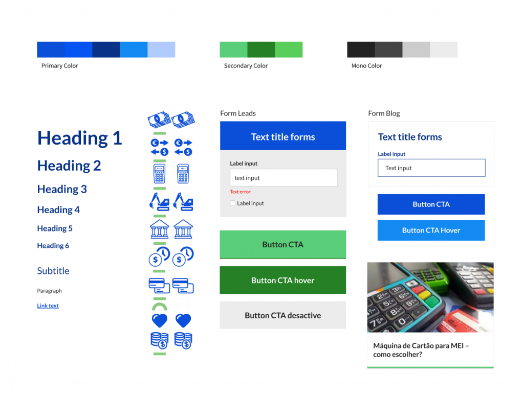
Logo / Colors
As a financial services company, I used graphic elements alongside the initials of the project name to create the logo. The colors used were chosen because they convey positive aspects of solidity and security.
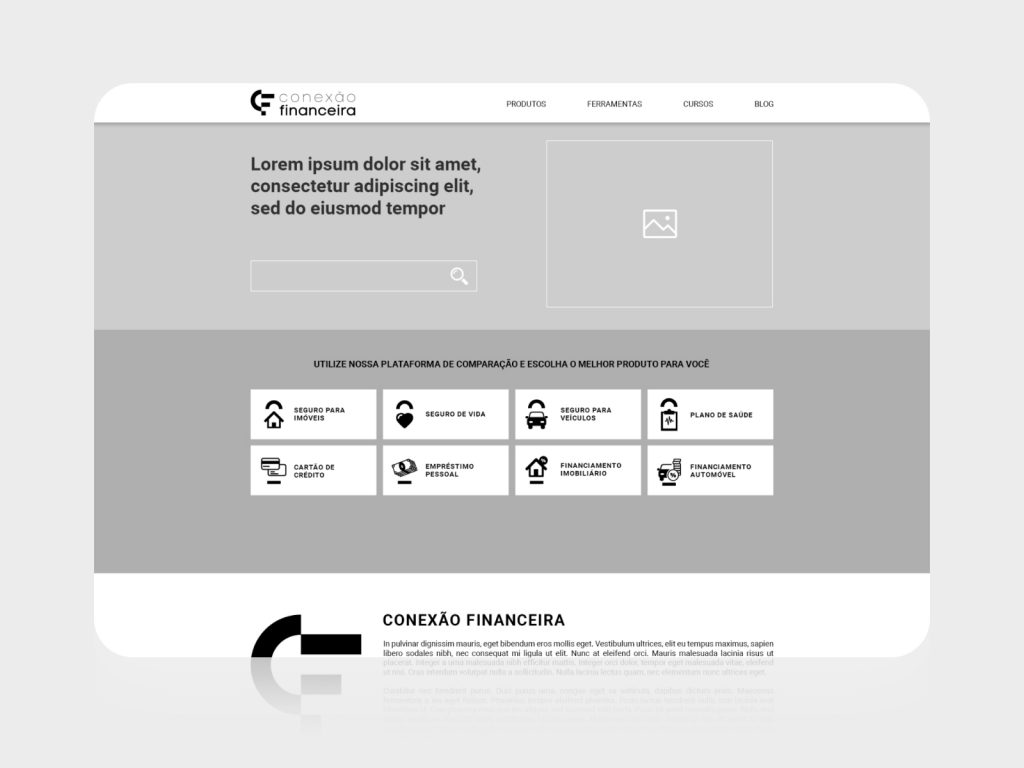
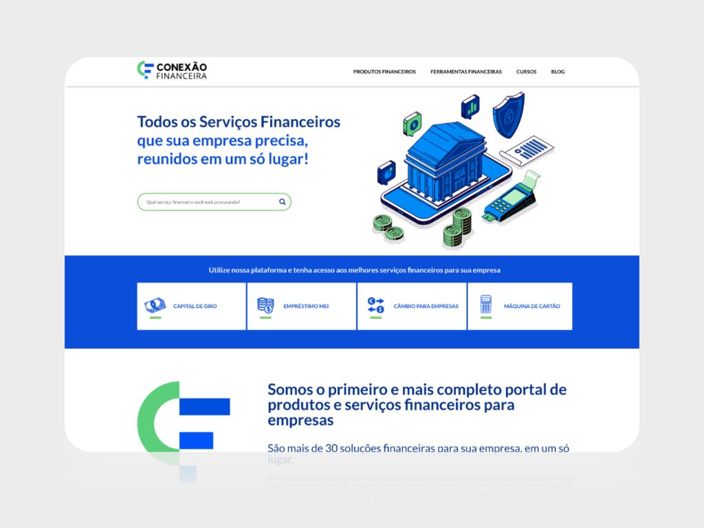
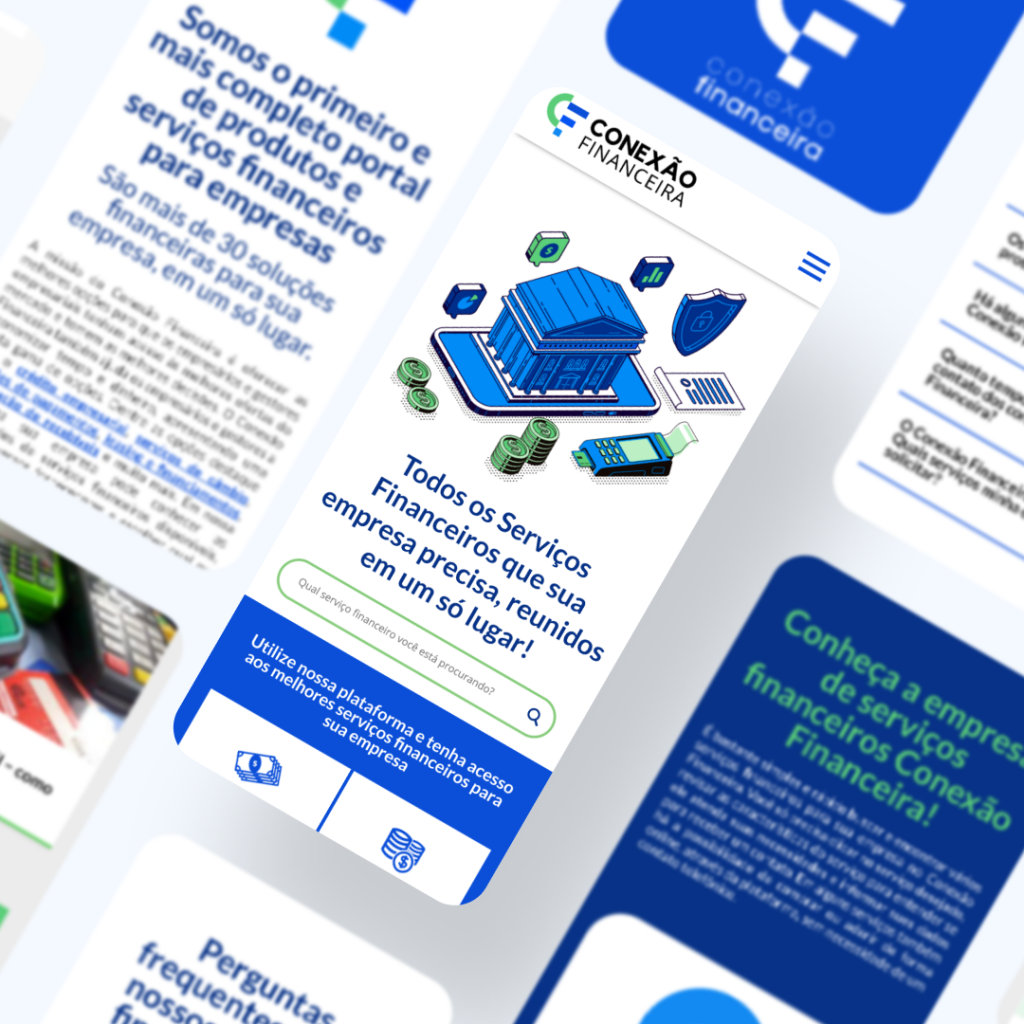
Site
The platform’s purpose is to inform and present financial solutions for companies. With this in mind, we present some of the financial solutions, a navigation menu, and a search field in the first view (first fold).
Information Architecture
The navigation menu labels, titles, and fields were defined based on research and understanding of the audience (how they search for and recognize the names of financial solutions).
On each product page, we provide a hierarchical content structure. This presents users with the features of each product in topics, as well as a navigation index and FAQ section.
Improvements and adjustments
Through internal analysis and research (conducted by an SEO consultancy), we realized that many visitors lacked knowledge about which solution was best suited for their company.
Therefore, we implemented the following improvements:
- We redesigned the homepage and highlighted the most visited and searched solutions;
- We provided an autocomplete function in the search field to facilitate searches;
- We adjusted the labels to reflect more familiar names among visitors;
- We expanded product content;
- We processed user-submitted information, selecting the products best suited to their profile.